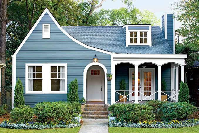
Slate blue is a sophisticated blue-gray color known for its calm, muted appearance and timeless character. Sitting between traditional blue and gray, slate blue offers enough color to create visual interest without becoming overly bright or dramatic.
The appeal of slate blue comes from its versatility. It can work beautifully in interior design, clothing, branding, websites, graphic design, photography, and home décor. Unlike vivid blues, this muted shade tends to create a more relaxed and refined atmosphere.
For anyone searching for slate blue, understanding its appearance, color values, complementary shades, and practical uses can make it easier to choose the right combination for a project.
What Is Slate Blue?
Slate blue is generally described as a medium-to-dark blue with noticeable gray or slightly violet undertones. Its name comes from slate, a natural rock that can display cool blue-gray tones.
The exact appearance of slate blue can vary depending on the color system, screen, lighting, and surrounding colors. In digital design, one commonly recognized HTML/CSS slate blue value is #6A5ACD, also known as SlateBlue.
This digital shade is more purple and saturated than the muted blue-gray color people may imagine when they hear the phrase. As a result, it is important to distinguish between a standardized digital color name and the broader descriptive term.
Slate Blue Color Code
For web designers and developers, the CSS color named SlateBlue has a hexadecimal value of #6A5ACD.
Its RGB value is 106, 90, 205, which creates a relatively rich blue-purple appearance. The color is included among the standardized named colors supported by modern web browsers.
However, paint manufacturers, fashion companies, and interior designers may use the name slate blue for substantially different shades. If you are choosing paint or fabric, relying only on the name can therefore be misleading.
For digital projects, using a precise hexadecimal or RGB value gives you much greater consistency.
The Meaning and Psychology of Slate Blue
Slate blue is often associated with calmness, intelligence, stability, sophistication, and trust. Because it contains blue, it can communicate qualities traditionally connected with cool and dependable colors.

The gray component makes slate blue feel more restrained than bright royal or electric blue. This makes it attractive to designers who want color without overwhelming the viewer.
In branding, slate blue can create a professional and modern impression. In interiors, it can feel peaceful and elegant. In fashion, the color can provide a refined alternative to standard navy or gray.
Color psychology is subjective, however, and cultural context can influence how people respond to particular shades.
Slate Blue in Interior Design
Slate blue can be an excellent choice for interiors because it sits comfortably between bold color and neutral tones.
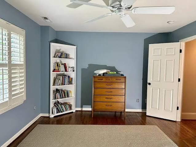
A slate blue wall can create a sophisticated backdrop in a bedroom, home office, living room, or hallway. When paired with warm wood, cream, white, or natural textures, the color can feel inviting rather than cold.
For a stronger contemporary look, designers can combine slate blue with charcoal, black, brushed metal, or clean white surfaces. The result can be particularly effective in modern or minimalist spaces.
Lighting should always be considered. Natural daylight may make the color look brighter, while warm artificial lighting can bring out softer or more muted undertones.
Slate Blue in Fashion
In clothing, slate blue offers a flexible alternative to conventional navy, denim, and charcoal.
A slate blue shirt, sweater, jacket, or dress can work well with neutral colors such as white, beige, gray, black, and cream. Depending on the specific shade, it can also complement warmer colors such as rust, camel, mustard, or muted brown.
The understated quality of slate blue makes it suitable for both casual and formal clothing. It can add personality to an outfit without becoming as visually dominant as a bright blue.
Accessories can also use the color effectively. A slate-blue handbag, scarf, tie, or pair of shoes can introduce a subtle accent to a neutral outfit.
Best Colors to Pair With Slate Blue
One of the strengths of slate blue is its ability to work with a broad range of colors.
White creates a crisp and clean contrast. Cream and ivory make slate blue feel warmer and softer, while light gray creates a sophisticated monochromatic combination.
For a natural interior or fashion palette, wood tones, tan, beige, and muted brown can work particularly well with slate blue.
If you want stronger contrast, consider warm complementary or near-complementary tones such as muted orange, terracotta, copper, or rust. These warmer shades can bring energy to an otherwise cool palette.
Slate Blue vs Navy Blue
Although slate blue and navy blue are both dark blue shades, they create different visual impressions.
Navy is typically deeper, darker, and more strongly associated with traditional formalwear and classic design. Slate blue, by contrast, generally has a softer, grayer or more violet character.
Navy can communicate authority and tradition, while slate blue often feels more contemporary and relaxed.
The right choice depends on the atmosphere you want. Navy is excellent for classic designs, while slate blue can provide a slightly more creative and modern appearance.
Slate Blue vs Slate Gray
The names can be confusing, but slate blue and slate gray are not the same.
Slate gray is primarily a gray color with cool blue undertones. Slate blue contains considerably more blue and can range from subdued blue-gray shades to richer blue-purple variations.
This distinction matters when selecting paint, clothing, graphics, or branding materials. Always examine the actual color sample instead of relying entirely on the name.
Using Slate Blue in Graphic and Web Design
Slate blue can be especially effective in digital design because it offers strong visual character without the intensity of brighter colors.
A designer might use slate blue for headings, buttons, backgrounds, icons, borders, or brand accents. When using the standardized CSS color #6A5ACD, designers should test the contrast against surrounding text to ensure accessibility.
The W3C Web Content Accessibility Guidelines provide established guidance for text contrast and accessible digital interfaces.
For websites, a slate blue palette can be combined with white, off-white, pale gray, or darker charcoal to create a polished interface. Using different shades of the same color can also create hierarchy without making the design feel overly colorful.
Slate Blue in Branding
Brands often use blue because it can communicate trust, reliability, technology, and professionalism. Slate blue adds a softer and more distinctive interpretation of that familiar color family.
A company using slate blue might create a brand identity that feels dependable but less conventional than a traditional corporate navy.
The shade can be particularly appropriate for technology companies, creative businesses, professional services, lifestyle brands, educational platforms, and design-focused organizations.
Still, color should support a broader brand strategy rather than being selected simply because a shade is fashionable.
How to Choose the Right Slate Blue
Choosing the right slate blue starts with understanding where the color will be used.
For a website, select a precise digital value and test it across different screens. For paint, examine physical samples under both natural and artificial lighting. For clothing, consider how the fabric texture affects the appearance of the color.
It is also useful to compare the shade against surrounding colors. A slate blue that appears soft next to white might look considerably darker beside black.
For SEO and design projects, clarity is equally important. If a specific color is required, provide its HEX, RGB, or another standardized value rather than relying only on the descriptive name.
Why Slate Blue Remains Popular
The enduring appeal of slate blue comes from its balance. It has the calm character of blue while incorporating the sophistication of gray or muted undertones.
That balance allows the color to move easily between different environments. It can appear professional in a website, elegant in clothing, relaxing in an interior, or creative in a brand identity.
Rather than demanding attention, slate blue tends to create an atmosphere. That makes it particularly useful for people who want color that feels refined rather than overwhelming.
Conclusion
Slate blue is a versatile and sophisticated color that can work across interior design, fashion, branding, digital graphics, and everyday styling. Its blue-gray character gives it a calm personality while allowing it to remain visually interesting.
The standardized CSS color called SlateBlue is #6A5ACD, although the broader term slate blue can describe a variety of blue-gray shades depending on the industry and color system.
Whether you are decorating a room, choosing an outfit, designing a website, or developing a brand palette, slate blue can provide an attractive balance between color and neutrality. The key is to examine the exact shade, consider lighting and surrounding colors, and use precise color values whenever consistency matters.
FAQs About Slate Blue
What color is slate blue?
Slate blue is generally a muted blue or blue-gray shade, although its exact appearance varies by color system.
What is the HEX code for SlateBlue?
The standard CSS color named SlateBlue has the HEX code #6A5ACD.
What colors go well with slate blue?
White, cream, beige, gray, charcoal, brown, rust, terracotta, and natural wood tones can pair effectively with slate blue.
Is slate blue a warm or cool color?
Slate blue is generally considered a cool color because of its blue foundation, although violet or gray undertones can influence its overall appearance.
Is slate blue the same as navy blue?
No. Navy is generally darker and more traditional, while slate blue tends to have softer gray or violet qualities.